For the first time in the history of Pantone’s Color of the Year, a new color has been created. PANTONE 17-3938 Very Peri will bring hope and a sense of renewal. The Color Institute created Veri Peri as a reminder to ‘embrace the altered landscape of possibilities’ and trust in the possibilities of the future.
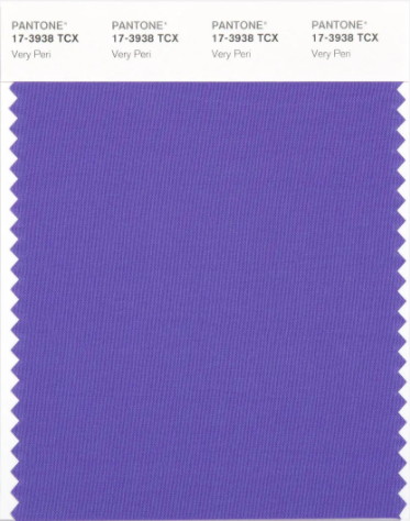
The new shade of periwinkle is a result of almost a year’s worth of research and trend forecasting. “We look at so many areas, from sports to fashion, to see what people are talking about” – Leatrice Eiseman.
To illustrate, the gaming industry is said to have been a large contributor to this year’s color selection.“There is just no question that gaming influenced the continued usage of Very Peri”. And “we really want the Color of the Year to be reflective of what is happening in the world around us”. – Eiseman
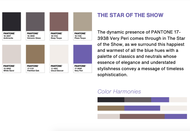
Very Peri is diverse. As a result, it can be used to create palettes that are timeless and sophisticated or playfully expressive. Pantone has created inspiring color palettes featuring the color of the year here.
About the Pantone Color of The Year
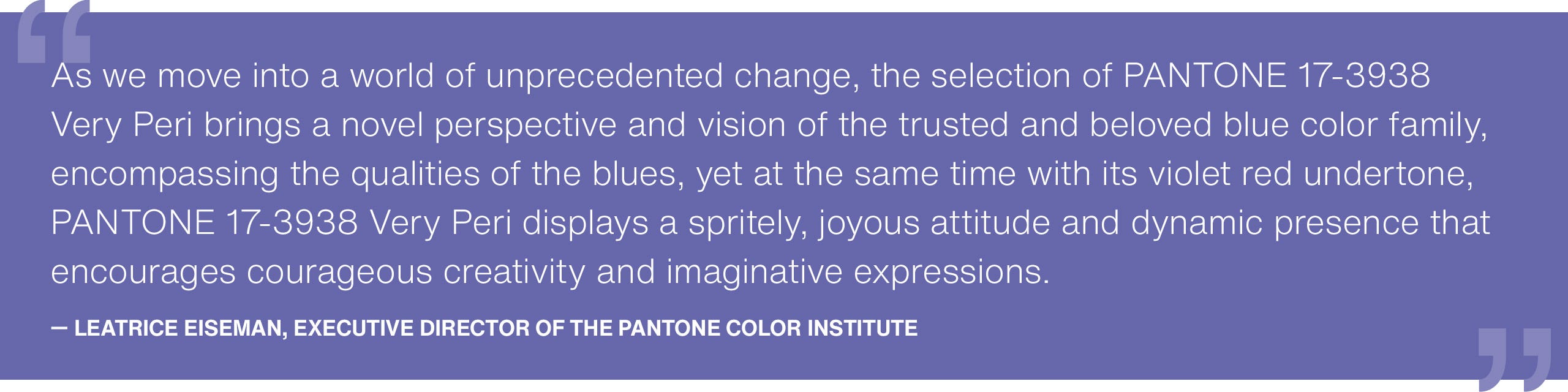
“The Pantone Color of the Year reflects what is taking place in our global culture.” – Laurie Pressman, Vice President of the Pantone Color Institute. “Creating a new color for the first time in the history of our PANTONE Color of the Year educational color program reflects the global innovation and transformation taking place. As society continues to recognize color as a critical form of communication, and a way to express and affect ideas and emotions and engage and connect, the complexity of this new red violet infused blue hue highlights the expansive possibilities that lay before us”.
A Look At the Past Few Years
For 2021, Pantone selected two colors, PANTONE 17-5104 Ultimate Gray + PANTONE 13-0647 Illuminating. A marriage of color conveying a message of strength and hopefulness that is both enduring and uplifting.
In 2020, Pantone selected Pantone 19-4052 Classic Blue to symbolising protection, stability, peace and confidence. Something I believe we can all agree was much needed in the first year of the Global pandemic.
2021 was the year for PANTONE 16-1546 Living Coral. “An Animating and life-affirming hue with golden undertone that energizes and enlivens with a softer edge.
For a deeper look at Pantone’s Color of the Year through the years, check out this article by House Beautiful.
Feel free to share this post: